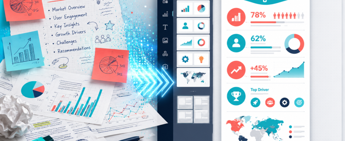
I gave Piktochart the kind of brief that makes generic AI design tools look clever for thirty seconds and then fall apart: five statistics, two caveats, one recommendation, and no obvious visual hierarchy.
The first result looked finished. That was not the same as being useful. The real test began when I asked whether a reader could understand the argument in ten seconds—and whether I could correct the chart, tighten the copy and export the format I actually needed.
Reports, explainers, one-pagers and infographics
Weak fit
Pixel-perfect brand systems or complex data analysis
Pricing and limits checked August 25, 2026 against Piktochart’s official plan comparison and AI infographic documentation.
The ten-second test
My source brief described a hypothetical creator campaign: reach increased 45%, newsletter sign-ups increased 18%, short-video completion fell 7%, and the highest-performing idea came from a customer question. The recommendation was to publish fewer clips but give each one a clearer promise.
I wanted the visual to answer three questions immediately: What changed? What caused it? What should the team do next? This is the same discipline I use when turning a recording into multiple assets in my 20-minute-video repurposing workflow. More outputs are not inherently better; every format needs a job.
What AI produced first
- A neat title and four equal-weight blocks
- Bright icons beside every statistic
- A pie chart for a number that was not part of a whole
- Too much explanatory copy
What made it publishable
- One dominant takeaway
- A bar or callout for directional change
- The caveat placed beside the affected metric
- A final action block, not another summary
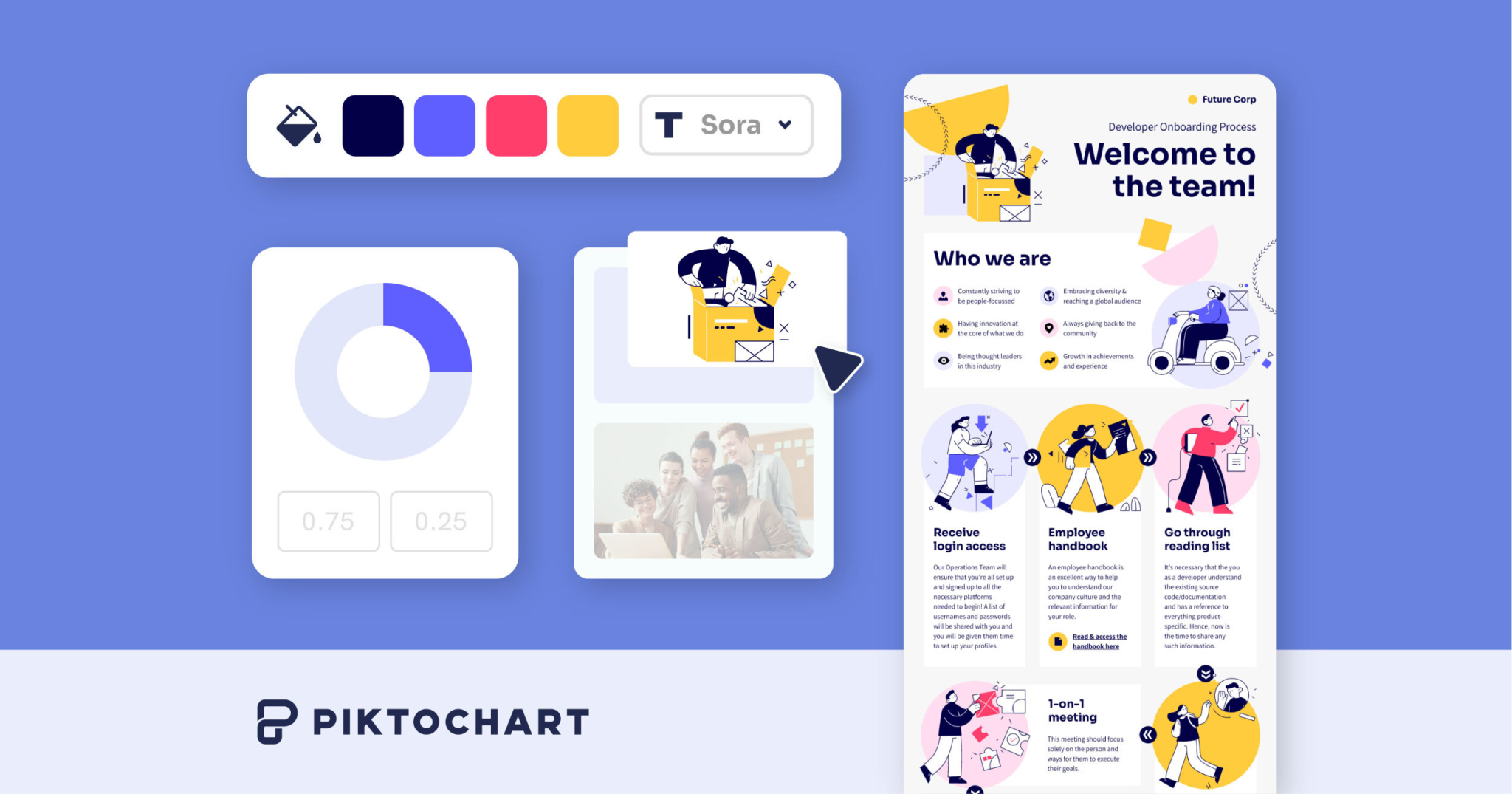
Piktochart AI is a layout partner, not a fact-checker
Piktochart can generate an infographic from a prompt, notes or an uploaded document. That removes the intimidating blank canvas. It can also suggest a structure and visual language faster than I can browse templates manually.
But an infographic is an argument made visible. If the hierarchy is wrong, a beautiful page can mislead more efficiently than an ugly one. I check the data in this order:
The temptation is to accept every icon and chart because they make the document feel complete. I delete anything that does not help comparison, sequence or emphasis. That is similar to choosing clips in OpusClip: the machine can surface candidates, but the creator still decides which moment carries meaning on its own. My Vizard AI review reaches the same conclusion from a more editable video workflow.
The free plan is useful—but two downloads changes how I test it
| Plan | Current price | What matters in practice |
|---|---|---|
| Free | $0 | Unlimited projects, 60 AI credits, free templates, 1GB storage, but only 2 PNG downloads |
| Pro | $10/member/month annually; $15 monthly | Unlimited PNG, 500 AI credits, premium assets, transparent backgrounds, 100GB |
| Business | $17/member/month annually; $20 monthly | PNG/PDF/PPT exports, Brand Kit, 1,000 AI credits, 250GB |
| Enterprise | Custom | SSO, workspace controls, onboarding and custom templates |
I would not spend the two free downloads on early versions. Share or preview the project, correct the content, then export the final size. Pro is enough if PNG is the destination. Business is the meaningful step for reports and presentation workflows because it adds PDF and PowerPoint downloads plus stronger brand controls.
Where Piktochart feels easier than a general design tool
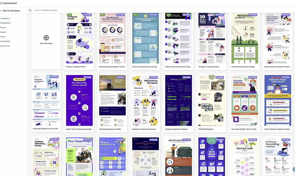
Piktochart is opinionated around infographics, reports, posters and one-pagers. I find that helpful. A broad design suite often presents too many destinations before I have clarified the story. Piktochart narrows the first decision to “what kind of information am I explaining?” The site’s design and branding tools directory is useful if you want a broader canvas instead.
Beginners who already find a clip editor manageable—my beginner OpusClip vs Vizard test uses first-session friction as the benchmark—should be comfortable with the basic Piktochart flow. The learning curve appears when you move beyond templates into custom spacing, charts, brand consistency and multi-page reports.
What I like—and what I would not trust
I like
- A prompt or document becomes an editable starting point
- The product is focused on information design
- Charts, maps and infographic assets live in one editor
- Free is enough to test the real workflow
- Business includes the formats serious reporting teams need
I would not trust blindly
- An automatically selected chart
- Equal visual weight for unequal findings
- A generated summary that drops a caveat
- Brand consistency before Business-level controls
- A PowerPoint export without opening it slide by slide
For a content team, Piktochart belongs after the idea is stable. I would collect the raw material, decide what deserves emphasis, and then use the editor. If the source is a podcast or interview, my AI podcast repurposing comparison explains which tools are better for transcript extraction before visual design begins.
My final verdict
Piktochart solves the blank-page problem better than it solves the judgment problem—and that is a worthwhile product. It can turn an intimidating brief into a visual draft quickly enough that a non-designer can spend time improving the message instead of arranging the first rectangle.
I would start on Free with one real infographic, not a toy prompt. If the final asset only needs to be a PNG, Pro is the practical regular-use plan. If PDF, PowerPoint and Brand Kit are part of the job, I would budget for Business from the beginning. The best result is not the design the AI generates; it is the one that survives your ten-second comprehension test. For the upstream video-to-visual workflow, see my practical Vizard AI guide.
Piktochart FAQ
Is Piktochart free?
Yes. Free includes unlimited visual projects, 60 AI credits and two PNG downloads.
Does Piktochart add a logo or watermark?
The plan comparison reserves “No Piktochart logo on downloads” for paid tiers. Treat Free as a workflow test and inspect the actual export before public use.
Is Piktochart better than Canva?
I prefer Piktochart for focused infographics and reports. Canva is broader for everyday social graphics, video and a larger general template ecosystem.
Can Piktochart export PowerPoint?
Yes on the Business plan; Business also adds PDF exports and Brand Kit controls.