

Piktochart and Visme can both turn a spreadsheet into something presentable. That overlap is why most comparisons become feature-table soup. I used a more revealing brief: the same quarterly dataset had to become a downloadable one-page report and a live ten-minute client presentation.
The tools did not produce the same answer. Piktochart helped me compress evidence into a clear static narrative. Visme gave me more room to stage the story, add interactivity and control how it unfolds on screen. The question is not which editor has more boxes ticked. It is whether your audience will read the output or experience it.
Choose Piktochart
for infographics, one-pagers, reports and fast data-to-document work.
Choose Visme
for presentations, interactive content, animated data and lead-generating published experiences.
The same-data brief
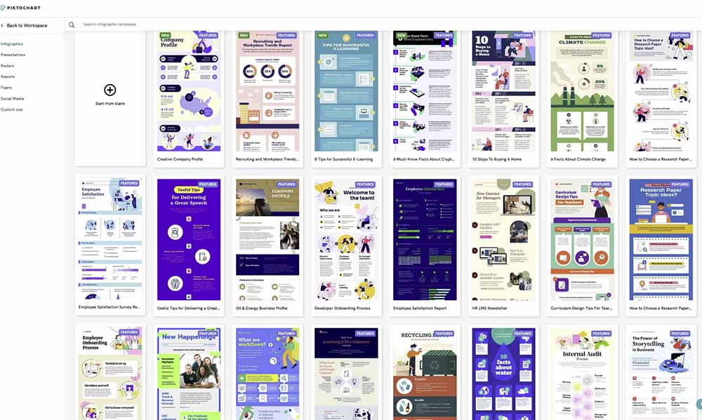
Piktochart’s structure pushed me to prioritise. A tall report cannot hide weak hierarchy behind transitions: the headline, chart order and annotations have to work at once. Its AI tools can create a first visual from text, but I still rebuilt chart labels and removed generic summary copy. The useful automation was scaffolding, not authorship.
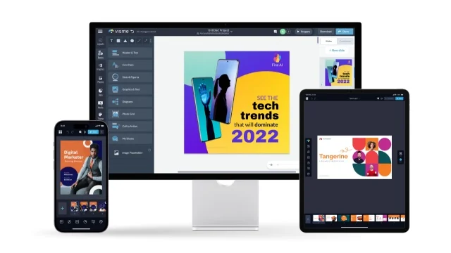
Visme let the same dataset breathe across slides. I could reveal one finding at a time, create richer chart scenes and add interactive elements for the shared version. That made the presentation more engaging—but also made it easier to over-design. I spent longer deciding what not to animate.
Piktochart vs Visme: the useful comparison
| Decision | Piktochart | Visme |
|---|---|---|
| Fast static infographic | Best fit | Capable, but more workspace than necessary |
| Long presentation | Good for simple decks | Stronger presentation depth |
| Interactive content | Basic publishing and embeds | Hotspots, animation, forms and richer experiences |
| Data-heavy one-pager | Clear report-first workflow | Flexible but easier to overcomplicate |
| Brand governance | Business plan unlocks full brand controls | Strong brand and team features on paid tiers |
| Learning curve | More direct for a single static deliverable | More possibilities, therefore more decisions |
For a deeper standalone look at each product, read my Piktochart review and Visme review. This comparison focuses on the decision between them, not repeating both feature lists.
Pricing is really an export question
Piktochart’s current Free plan includes two PNG downloads, unlimited projects, 60 AI credits and 1GB storage. Pro is $10 per member per month billed annually ($15 monthly) with unlimited PNG downloads and 500 AI credits. Business is $17 annually billed per member ($20 monthly) and adds PNG, PDF and PowerPoint export, full Brand Kit features and 1,000 AI credits.
That means a buyer who needs client-ready PDF or PPT delivery should price Piktochart Business, not Pro. The headline Pro price can be misleading if your actual deliverable is not PNG.
Visme also reserves its most useful download, brand, privacy and team capabilities for paid plans, and pricing can vary by billing cycle and account type. I would test the exact export route before subscribing: animated/interactive work is most valuable when published online, while a client may insist on PowerPoint or PDF.
Where each tool annoyed me
Piktochart: brand controls climb the pricing ladder
The editor is easy to start, but serious brand systems and broader exports push you toward Business. Pro’s PNG-only export is an important limitation for report teams.
Visme: capability creates friction
Visme offers more ways to build and publish, but the interface asks more of the creator. For a simple chart-led handout, I was faster in Piktochart. For a live client story, the extra time paid off.
Neither replaces editorial judgement
AI can propose a structure, but it cannot decide which metric deserves visual emphasis. A beautiful chart with the wrong denominator is still wrong. I checked source numbers after every transformation.
Which one fits your content stack?
Report-led marketer
Choose Piktochart. It connects research, charts and a scannable final document with less ceremony.
Presentation-led consultant
Choose Visme. Its slide, animation and interactive publishing depth better supports live persuasion.
Social-first creator
Consider a lighter graphic tool. Our Snappa review covers fast static graphics, while the VistaCreate review focuses on multi-format motion campaigns.
If the visual is only one branch of a larger content engine, start with the long-video repurposing workflow and use Piktochart or Visme for the data-backed carousel, lead magnet or presentation. For an entire micro-brand—logo, mockup, video and site—the Renderforest review examines a broader but shallower suite.
My final verdict
I finished both deliverables, but I would not swap the tools. Piktochart made the better one-page report because it encouraged compression and reading order. Visme made the better presentation because it treated sequence, motion and interaction as first-class choices.
Choose the output before the software. If a busy reader must understand the message without you, Piktochart is my pick. If you will guide an audience through the story—or want them to explore it online—Visme earns the extra complexity. You can see both alongside other options in our Design & Branding tools directory.
Frequently asked questions
Is Piktochart better than Visme for infographics?
For fast static infographics and reports, I prefer Piktochart. Visme is stronger when the infographic needs animation or interactivity.
Is Visme better for presentations?
Yes. Visme offers a deeper presentation workflow, especially for animation, interactive delivery and online sharing.
Which is easier for beginners?
Piktochart is easier for one defined static output. Visme remains beginner-friendly but exposes more options and therefore takes longer to master.
Pricing and product details last fact-checked August 26, 2026.